Mario vs Donkey Kong for Switch is a classic remake of the original Game Boy Advance, reimagining each stage in higher fidelity, turning interstitial stills into animated videos and even adding some additional content. Digital Foundry's John Linneman and Tom Morgan had the chance to play through the game on both platforms recently, summarizing the differences between the two versions and the quality of the remake overall.
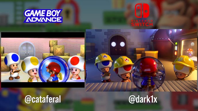
The deliberate resemblance between the two versions is evident even from the start screen, with Mario and Donkey Kong staring at each other from opposite corners of the screen on both Game Boy Advance and Switch. From here, there's a similar save data screen, then you're straight into a cutscene – with essentially a series of stills for the GBA version that have been turned into fully realized and high-quality 16:9 video for Switch. This sequence ends and Donkey Kong squeezes into a keyhole on both versions, starting the first level proper.
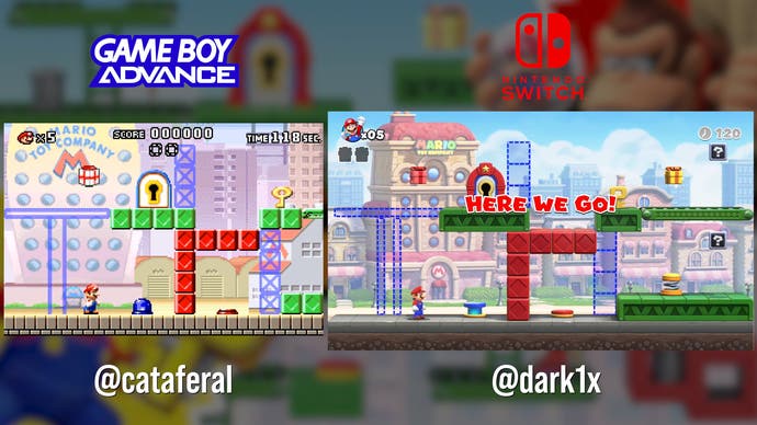
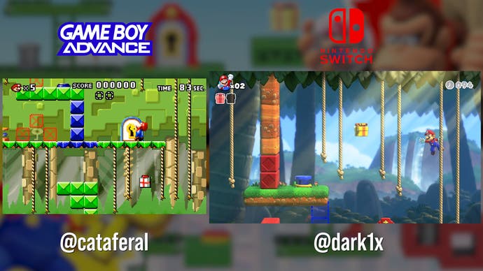
Looking at that first screen, it's clear that it's a 1:1 remake with the same tiles, background and scale – but the wider screen of the Switch allows us to see further to the right of these relatively small puzzle stages. Even the interface is nearly identical, with lives in the upper left and time in the upper right – just the score has been removed from the top center for a cleaner presentation.
Mario vs Donkey Kong: Switch vs Game Boy Advance – An Excellent Remake!
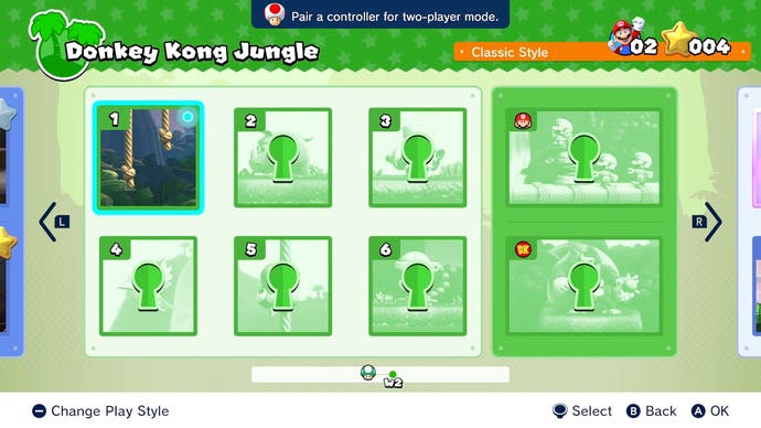
The Switch version does add a casual mode, which removes the time limit for completing each stage, adds checkpoints and makes it much harder for Mario to lose lives, but on classic mode plays much the same as the original. There are also two extra worlds to explore – Merry Mini-Land and the Slippery Summit, each with Plus counterparts – that provide a bit more of a challenge for experienced players. There's also two-player co-op, which sees two players playing as Toad and collecting an extra key to progress.
In terms of presentation, the game doesn't push any technical boundaries, but it realizes the intended look at full resolution – 1080p docked or 720p handheld – and at a flawless 60fps. Similarly, there's no anti-aliasing but at 1080p it's not an egregious omission.
Interestingly, AMD's FidelityFX is listed amongst the credits, but it's likely that the game is using contrast adaptive sharpening (CAS) rather than FSR 1 upscaling, for example.


Loading speed is a little slower than the cartridge-based GBA, but it's masked with a zoom effect and isn't long enough to be annoying.
The overall look of the game is more similar to New Super Mario Brothers rather than the later Super Mario Wonder, with a slightly darker and more muted color palette that matches the look of the original GBA screen rather than the brighter Game Boy Advance SP models.
It's possible to find some minor graphical oddities too. For example, enemies possess both circular shadows and more realistic shadows when you'd normally expect to see one or the other. There's also some evidence of color transfer from the environment onto shiny objects like rubbish bins, but this appears to be baked and doesn't change as these items move around the level.


Despite these minor curiosities though, Mario vs Donkey Kong is undoubtedly a successful remake that manages to capture the magic of the original and bring it to the modern era.
You only need to look at the likes of the recent Advance Wars remake, which somehow exhibited performance issues and had a divisive shiny look to its models, to know that these sorts of remakes aren't a glove slam dunk. This one at least is up to Nintendo's usual high standards.
#Mario #Donkey #Kong #Switch #impressive #remake #true #Nintendo #quality

