I return from New York, from the inauguration of the new Olnick-Spanu Magazzino pavilion, with my eyes full of its wonderful collection of Carlo Scarpa crystals and the magnificent exhibition space built with light by Alberto Campo Baeza and Miguel Quismondo and, in a synchronicity worthy of Carl Jung, ICON Design gives me the gift of writing about one of the most beautiful exhibition spaces of contemporary European architecture: the Gypsotheca Antonio Canova Museum in Possagno, made by Scarpa himself (1906-1978). A project that the Venetian made with sculptures and, above all, light.
Very few artists have marked the ideals of neoclassical art as purely as Antonio Canova. The Venetian sculptor born in Possagno and educated in Venice found in 18th century Rome the field for his complete development, even becoming the Pontiff's General Inspector of Antiquities. Canova was a member of a group of intellectuals and artists who explored the limits of classical artistic knowledge. He was not a copyist, but he knew the language and spirit of classical art in such a rational and intense way that he was able to generate new works with that same spirit. His works still populate all the great Western museums.
Canova worked from preparatory drawings and sketches in terracotta and wax, and made life-size clay models from which his mold was made. The plaster casts of these were prepared to be able to transfer their shape, with a dot technique, to the marble block, introducing bronze nails that were used to take measurements and transfer them later. Her assistants roughed the marble to an approximate shape, and he gave it the final shape and that wonderful polish that characterized her work, turning the marble into real flesh.
Upon Canova's death in 1822 his half-brother and heir, the Abbe Sartori, moved the contents of his Roman studio, including all his plasters, to his native Possagno. In 1832 he commissioned the Venetian architect Lazzari to create an exhibition space next to his birthplace. Lazzari conceived a white basilica illuminated from above to install the pieces in a calm and timeless atmosphere.
In 1955, with a view to the bicentenary of its birth in 1957, the collection was placed in the hands of the best architect-museographer that 20th century Italy produced, Carlo Scarpa, who was commissioned to expand the Gypsotheca Museum.
At the Canova Museum, Scarpa deals with all scales of sculpture and architecture, including that which makes museography an interface between the two. He executes the grand opera, the total work, the space that contains the pieces and us, the floors and walls that guide us, the supports on which the works rest and the scenographic arrangement of all of them and their visitors at the same time. . He plays with nature, creating volumes that are articulated with the pre-existing buildings at the foot of the hills, opening the interiors to the green of the hills and the blue of the sky. He arranges ponds of water to act as a luminous mirror, reflecting the colors of nature on the candid skin of the plaster of The three Graces by Canova. Colors that vary with the day, with the sky, variants like life.


Although in the two successive actions in Possagno, in 1832 and in 1955, the content of the collection to be exhibited is known in advance, the project strategies are different. Lazzari's, the basilica, is to create a container. A neutral space where the museography, the installation of the pieces and the tour later generate a new understanding. Scarpa, on the other hand, works simultaneously with architecture and museography. He is thinking about how to place each piece, creating a significant space for it, for the interrelation between them, offering a wide range of lighting possibilities, contrasting spaces, walls and proportions. For him, architecture and museography merge into a single whole.
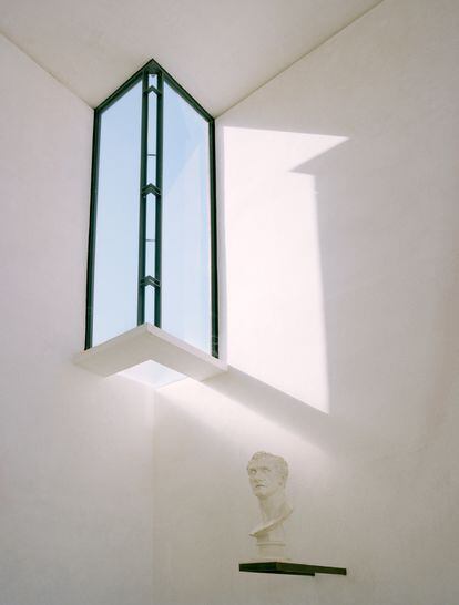
He creates a true camera of light that captures it in all directions and in all possible ways to bathe the pieces because, according to him, sunlight should slide over them and increase their beauty. By expanding it, he adds new spatial strata, parallel to the wall of the Lazzari basilica. Its wall becomes a light chamber to illuminate, in a thousand ways, the new adjacent trapezoidal space. He designs it like a gallery prospetticsin which its trapezoidal plan and its section of successive descending spaces make everything point to the figure of The three Graceswhich are silhouetted against nature, against a glass window that rises open to the sky, and to outer space, with no limits other than its transparent dihedral.
The entrance to the Scarpa wing is through a transverse axis, from the vestibule of the basilica, centered on sculpture of Adonis crowned by Venusand ends in a tall, beautiful, square room, which houses the sculpture of Washington and on the wall the self-portrait bust of Canova. It introduces light by breaking the four corners: two by two, with two trihedral skylights, which open to the heavens and let the space escape, and with two skylights that enter powerfully, marking the main façade of t
his piece. He supports them on linear supports, similar to those he uses for sculptures, as sculptural pieces, which cause the entry of a grazing light that slides along the walls, marking the pieces.
Scarpa creates his spaces with light, making it burst in every possible way, from above, in horizontal backlight at the bottom of the forced perspective of the trapezoidal space that houses The three Graces, silhouetted against the landscape and illuminated by the reflections in the water of a pond at their feet and by the light that bounces off the walls of the Basilica and enters through the points that mark the wall that borders it. A wall that is quite a poem and is made up of spaces with reliefs, glass transparencies, or perforated planes with small openings that illuminate while acting as a background for the sculptural group, ending as a blind wall that frames The three Graces from outside.
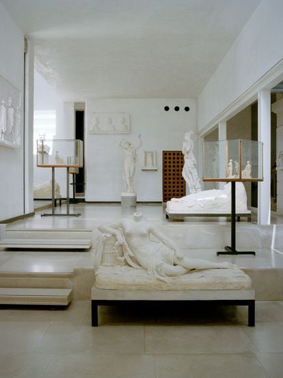
The works ride on steps, as polished as Canova's works. In some cases, they act as a link between two spaces, between two levels, and the beds he designs, supports for his recumbent sculptures, sometimes have legs of different heights to support themselves on one level and the next.
Scarpa plays with all spatial scales. Its wonderful display cases are small rooms within the room, supported by an axis on which rides the space defined by the plane of the floor and the four corners, leaving the relationship of the glass walls with its ceiling as a simple and transparent dihedral of glass, in the same way that he made those of the Venezuelan pavilion at the Venice Biennale.
He designs subtle supports that are anchored to the walls holding skylights, busts and small sculptures, which form a frieze with them and make their shadows, caused by the grazing light, slide over the walls and articulate it. His work with the contrasting white plasters on the white walls is almost a neoclassical wash, that drawing technique with gradient gray inks that allowed the white surface of the facades to be modulated. A white-on-white study that allows you to build only with light and watch it move across the reliefs of its walls. The recumbent figures are placed on abstract beds and the large pieces on solid pedestals like that of Washington, in which the pedestal is broken by the articulation of the volumes that form it so that its visual weight does not alter the mass balance of the sculpture. that crowns it.
Scarpa's work is a masterpiece of balance between the sculptures and the space that supports them. The sensitivity of his work can be seen in the magnificent proportions and in the delicate balance that is established between the masses, in the perspectives created, in how the works are surrounded, in how they appear cut out or in dialogue with each other. In that interrelation of scales that she builds a story and that serves to give greater depth and dimension to the entire set, in how she manages to create different sets and groups with the same pieces by looking at them in perpendicular or opposite directions. Scarpa plays with gravity, materializes and dematerializes the works thanks to light, reflections on the walls and water, as he learned in his Venice. He is the king of scale, texture and the minimum detail that builds great architecture, whether with a simple edge on the floor, with a step or with the details of the profiles of a skylight.
When a museum story is built with a collection, it is the pieces that rule, those that make the journey tense, those that take us and attract us. How we arrange them and make them dialogue modifies the space, transforming it into another, making it grow, modulating it, giving it another intensity. There is an important part in this work of rationality, but also of sensitivity, of understanding what the works tell you, of linking their proportions to the proportions of the space that houses them, of letting them expand and take the air they need. His respectful language is both timeless and rabidly contemporary. It brings Canova's work to the present, making the viewer contemplate said work from the perspective of the now and feel linked to it, not distanced because it belongs to another time. Its simple and correct forms are mere spaces of light and a manifestation of a delicate use of proportions that provokes great beauty.
You can follow ICON on Facebook, x, instagram,or subscribe here to the Newsletter.
#Scarpa #Wing #Canova #Museum #masterpiece #reinvented #relationship #art #architecture

