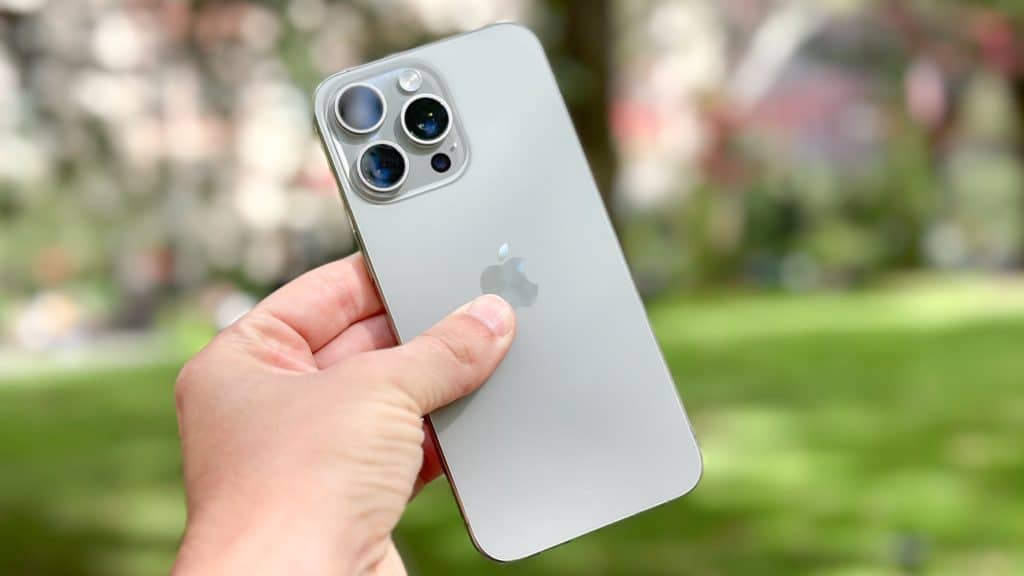
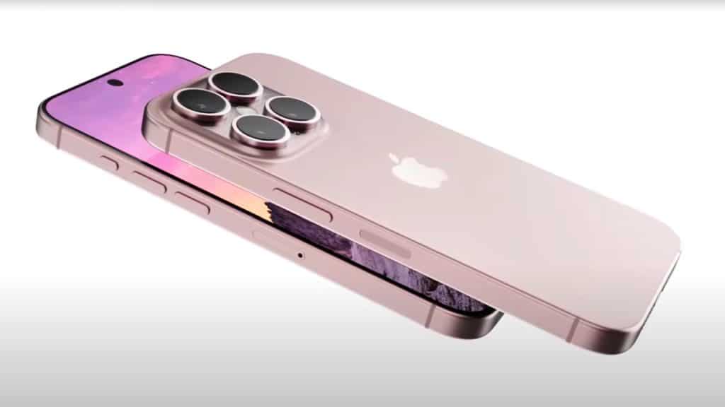
Let’s face it, Apple has always had a certain ability to surprise its users and, sometimes, even confuse them by releasing strange novelties. The presentation of the new iPhone 16, with the introduction of the long-awaited Camera Control Button, was no exception. This physical (but not too much) button, located on the side of the device, promises to give users more intuitive and direct control of the camera. But a question arises spontaneously: was it really necessary?
iPhone 16: How Does the Camera Control Button Work?
The Camera Control Button is a haptic button dedicated exclusively to controlling the iPhone 16 camera. Located on the right side of the phone, it is designed to allow users to access quickly to the camera and take photos or record videos more immediately and intuitively.
Its operation is simple: a single quick press of the button activates the camera, even if the screen is locked. If you hold it down, it automatically starts recording a video, a function similar to one that already exists in the iOS interface, but now made more accessible by this physical button.
Furthermore, its pressure sensitivity allows to vary the zoom intensity or switch between shooting modes, like portrait or wide angle, without having to touch the iPhone 16 screen.
At first glance, this button might be useful in situations where it is not practical to unlock the phone or navigate the interface, such as when you want to take a quick photo or record an unexpected moment or a breathtaking panorama. However, the real question I ask myself is whether this be such a significant improvement over the existing gestures.

In a market where the trend in recent years has been to simplify the user interface and reduce physical buttons to a minimum, the introduction of a dedicated camera button seems to go against the grain. Modern touchscreen interfaces, such as the iPhone’s, allow for quick access to the camera with a simple gesture, without the need for a dedicated button.
So, maybe we should ask ourselves why add a new button? Apple itself explains: the goal is to improve the photography experience, allowing immediate access to the camera even when the phone is locked or in standby mode.
However, It doesn’t look like this button does anything that can’t already be done other ways. But adding a physical button could go against the minimalist philosophy that Apple has always promoted.
Do you remember the golden times? The presentation of the first iPhones by the esteemed creator and leader of Apple? The elimination of physical buttons, the simplification! Maybe we should ask ourselves whether Steve Jobs would have really shared this design choice.
But the other side of the coin is present! Navigating on Redditmany users, are happy and claim that this button can seem a return to the past.
Smartphones with dedicated physical camera buttons are nothing new. Many older Android phones had features of this type built in. But the trend has been to eliminate these options in favor of a more fluid and Smart interaction. The camera control button on the iPhone 16, therefore, it appears like a risky choice that is perhaps now too immature to be understood.

Beyond this reflection, one thing is certain! The iPhone 16 undoubtedly has one of the best cameras on the market, with improved low-light performance, a larger sensor and new software features for photography that also uses AI.
To laugh about it, it would seem that Apple is trying to solve a problem that doesn’t exist: the speed with which you can access the camera has never been a weak point of the iPhone, and a physical button doesn’t add much value to this feature.
Furthermore, in a market that is increasingly moving towards AI, perhaps it would be a good idea focus much more on it than going back to the past. This is because it can automatically enhance shots as we have seen in the Pixel and Galaxy. A physical button seems to be a mechanical solution for a need that is increasingly managed by software.
Apple has often shown that it knows how to look to the future, so obviously it is still too early to make a definitive judgment, but in this case more than others I feel like reiterating for one last time that the Camera Control Button It appears to be more of a symbolic than functional addition.
Perhaps the real future of smartphone photography will not be through physical buttons, but rather through increasingly advanced software innovations, capable of making the photographic experience even more intuitive. without the need for additional complications.
#iPhone #Camera #Control #button #genius #useless #addition